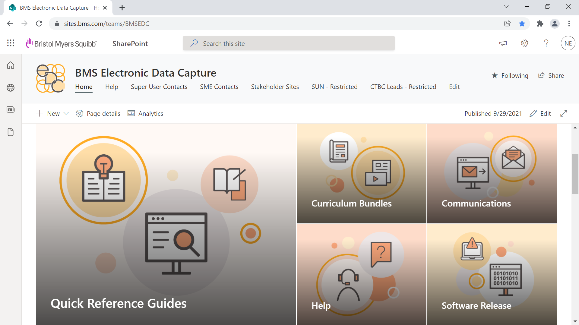
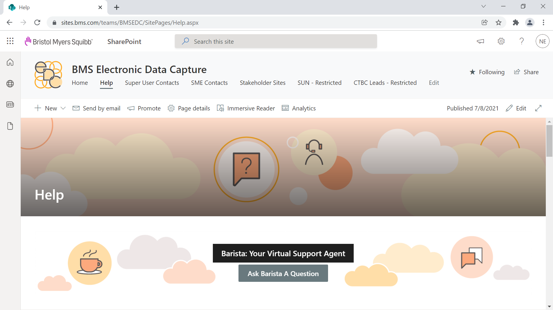
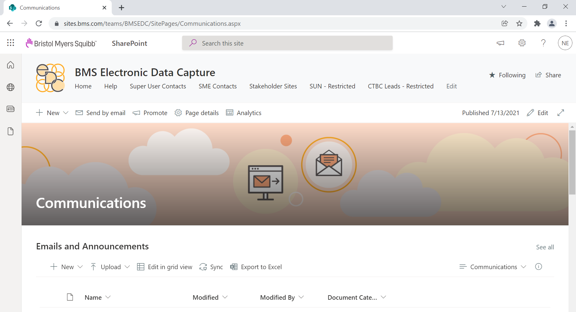
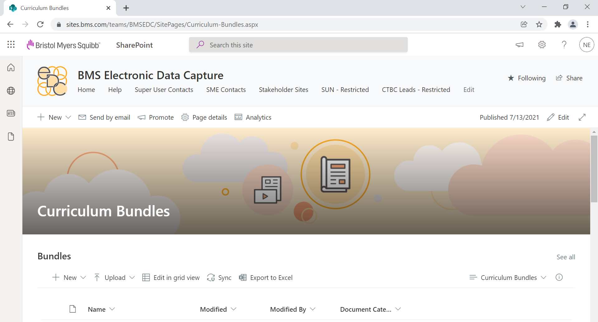
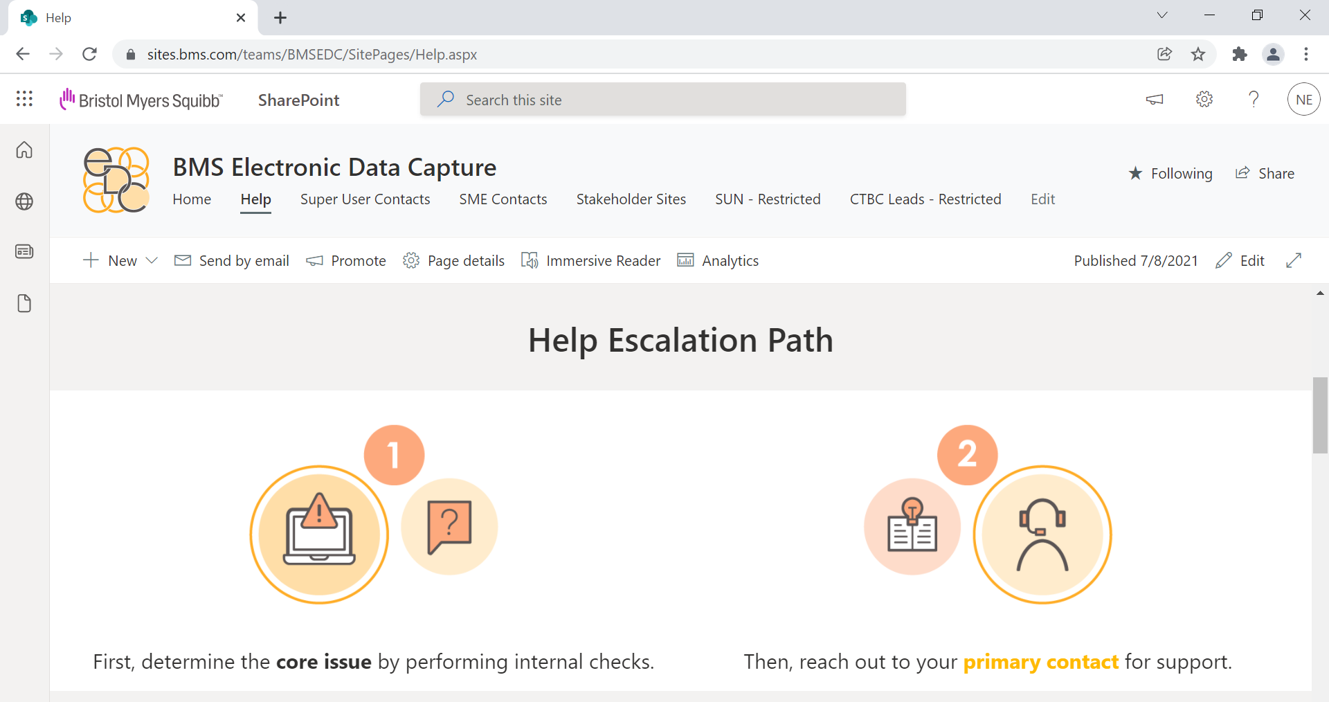
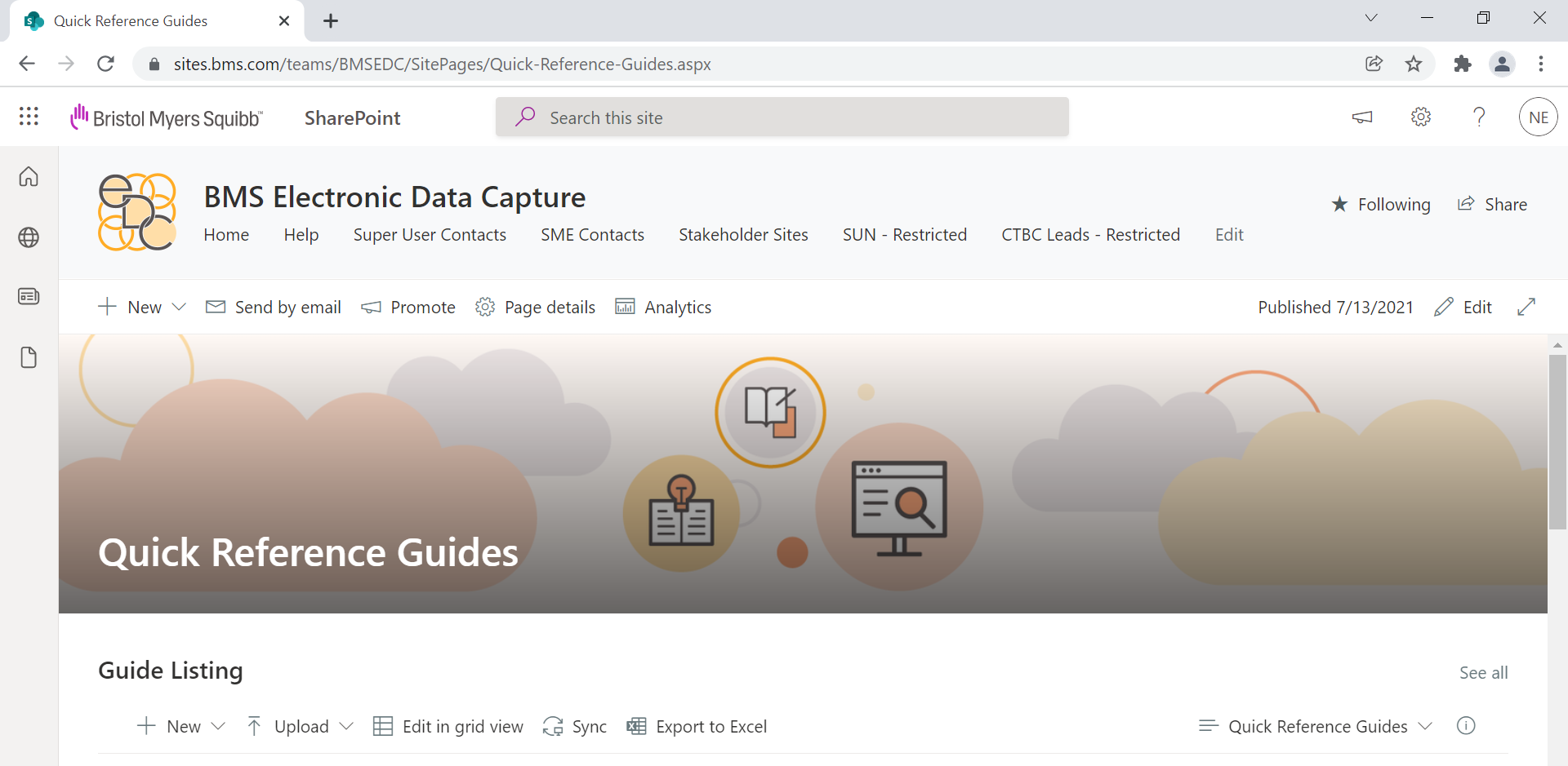
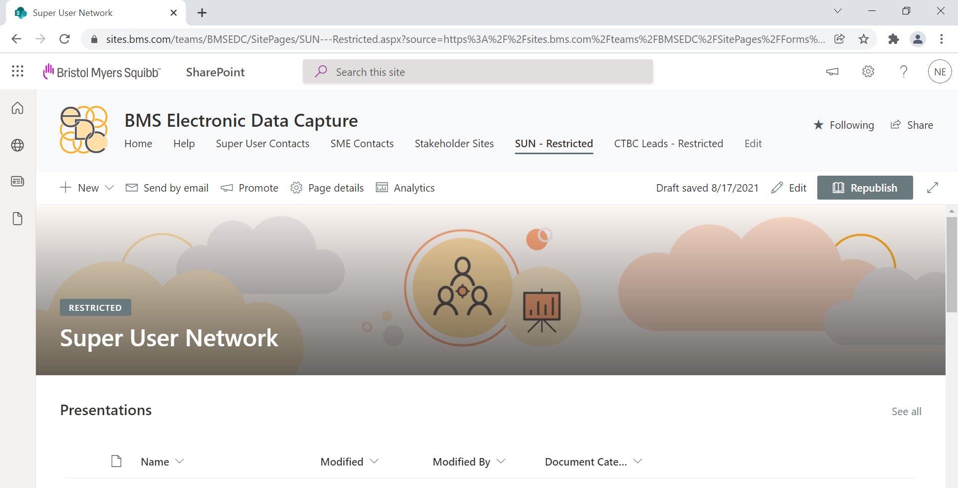
Below is a look at the process of the rebrand. This is the original icon. Our goal was to design a new logo that aligned with the new company branding while still emulating the old logo.
Below are the first round of logo options, out of which the clients liked the 6th option best.
Then I made 5 more options based off #6, and the 1st was the favorite.
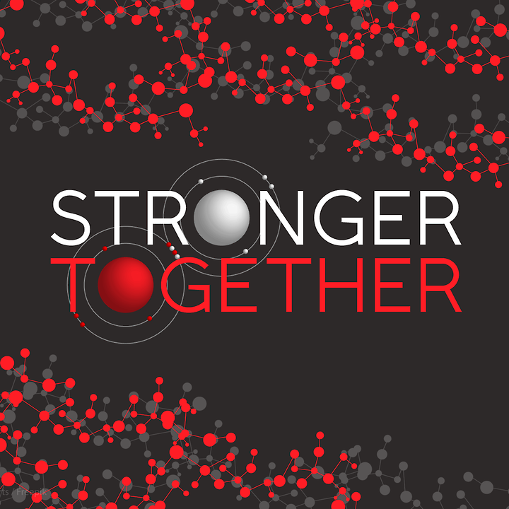
Then I made 3 versions of that option and we decided to go with the 3rd one. Now that the new logo was established I designed the rest of the graphics to match its style to bring a cohesive and recognizable feel to the EDC SharePoint and related content.

